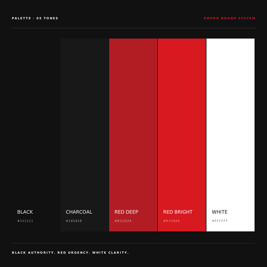
BLACK AUTHORITY. RED URGENCY. WHITE CLARITY.
Three colors, one argument. Red never decorates — it always signals action or urgency. Black carries weight. White gives clarity. No blue anywhere.
Every competitor in the category uses the same blue palette, the same stock handshake, the same 'people first' tagline. EMPRO refused all of it — and rebuilt the brand as if it were the operations partner it actually is.
EMPRO Staffing Solutions is a Southern California workforce provider covering warehouse, industrial, logistics, manufacturing, and delivery operations — around 30 internal staff placing up to 700 workers at any given time. The problem wasn't performance. The problem was perception: at first glance EMPRO looked like every other regional staffing firm, which was exactly the position that lost them mid-market operations accounts to bigger names. The rebuild had to shift how the company was read — not just by candidates, but by ops leaders comparing them to Fortune-500-tier vendors.
Category defaults are the cheapest thing a brand can inherit and the most expensive thing to keep. We dropped all of them.
Three colors, one argument. Red never decorates — it always signals action or urgency. Black carries weight. White gives clarity. No blue anywhere.
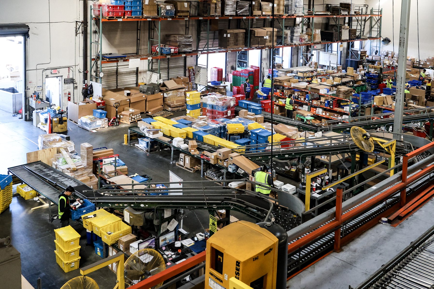
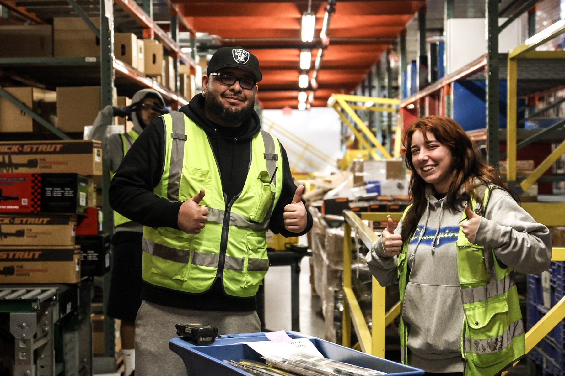
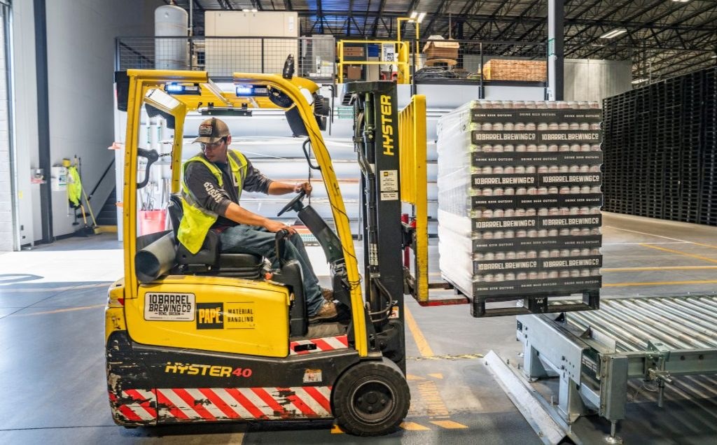
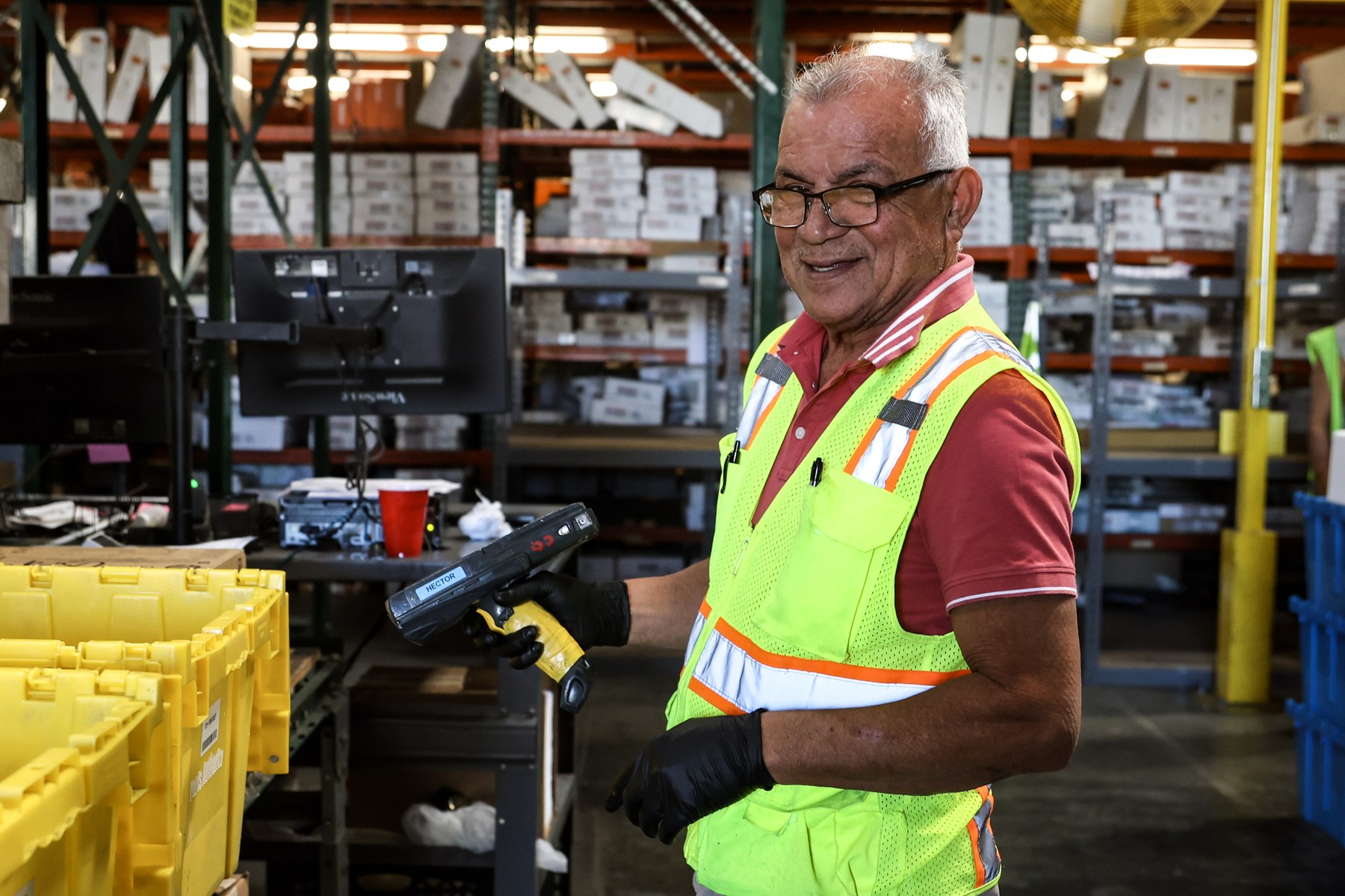
No stock handshakes. Every campaign photograph shot on the real EMPRO warehouse floor, with the real EMPRO team, in real PPE. The gallery below is the proof — not a moodboard, the actual asset library.
HR-speak disappeared. Language dropped to short sentences and real staffing terms. 'Reliable people for demanding operations.' Language did half the positioning work.
The same rules apply to a print recruiting flyer, an Instagram post, an internal HR incident report, and the ATS admin dashboard. Consistency is the compound interest of brand.
The diagonal red motion mark from the logo isn't a graphic flourish. It's a system that carries across print, digital, and application flows — the visual shorthand for speed.
A staffing brand publishes weekly at minimum. So every asset — flyer, post, guide, dashboard — was designed as a template the internal team can update without breaking the look.
Each deliverable ships as a complete, self-contained system. They share the same rules — three colors, heavy type, motion mark, operator voice — and they never break the look when the team updates them.
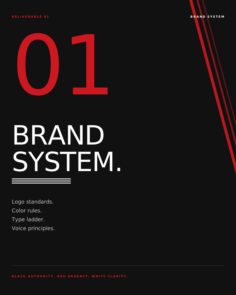
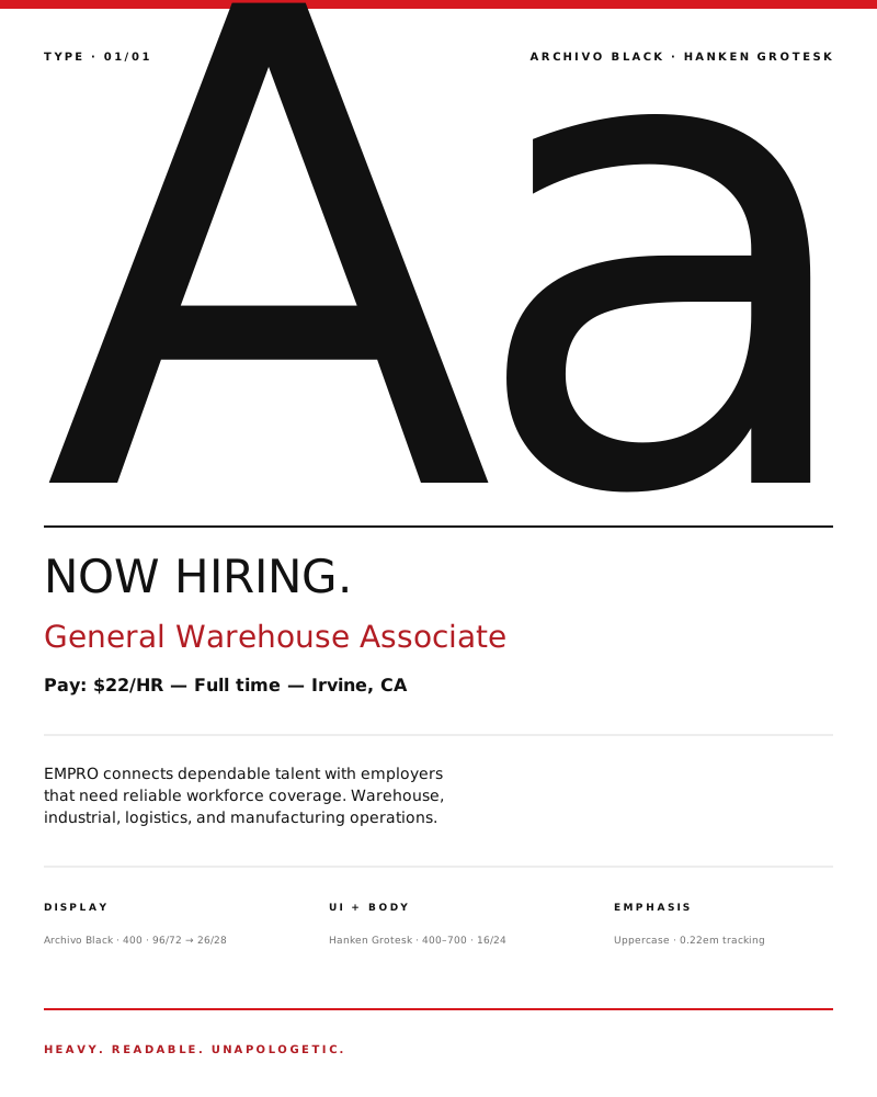
Logo standards, palette, typography ladder, and voice principles. The document the internal team uses to answer 'does this look like EMPRO?' before anything ships.
Real numbers to be finalized once Q1 reporting closes. Placeholder metrics below reflect early directional signal from the original brand redesign engagement.
+38%
Proposal Win Rate
Sales started opening conversations from a position of authority.
−21%
Sales Cycle Length
Ops leaders qualified faster once brand impression matched capability.
4.2×
Inbound Brand Mentions
Named references from partners, LinkedIn, and industry press.
Q1 2026
Full Reporting
Final numbers pending — real metrics will replace placeholders here.
Real work first: the shipping website, the actual ATS admin, on-site photography, and a recruiting flyer built to the brand system. The design-system tiles below are the operational backbone that keeps every touchpoint from drifting.
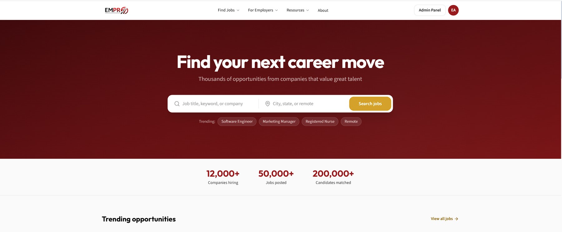
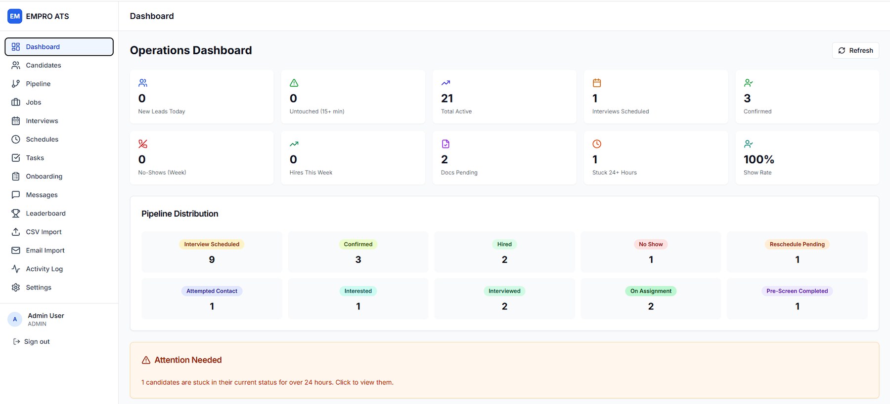
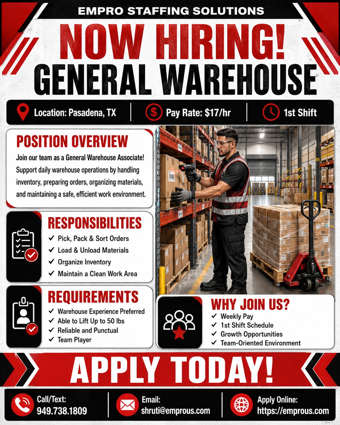
Brand, digital, content, and internal systems, treated as one connected practice. If that's the conversation you're trying to have, this is where it starts.
